Wednesday, 31 March 2010
Finally!
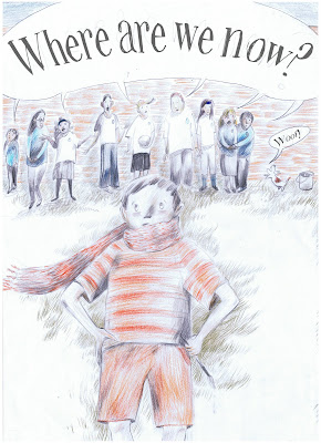
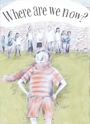
Sorry i haven't posted anything sooner, it's taking me ages to do these drawings! I've found this is more difficult than the others. Had some issues with the scanner too, it doesn't pick up the detail or the colour as well as I'd like, lost a lot of shadowing on the window because it was a pale blue but think you can get the idea. I'm having issues with the people on the umbrella image, I didn't want them to be too pronounced but they look a bit messy?
beckie x
Tuesday, 30 March 2010
rough idea...
test. and advice?
Sorry for the double post, but I'm after a bit of help on this piece. It's just a rough so I haven't included text. Basically in the sea it will read 'But then the whale said' -
The boy has pretty much given up and the whale is pointing out that he has actually got a friend in the octopus on his head. Whey!
My concerns are...is the image too flat? I didnt want too much to be going on what with all this pattern and incorporated text?
Also, I'm not sure wether or not to do the sea in the thicker pen or the thin pen?
Anything you want to point out is more then welcome :)
cheers, lou xx
hmm.
why do i seem to be the only person posting guys!!!?
Anyway...here is the squirrel that would be to the left of the owl. I'm thinking his tail is too messy and i need to sort that out? And his face needs a little work..
I wasn't sure wether to use the same map as i did on the owl because the pages need to look a little different, so i used a slightly different map for this, if it doesn't work i can easily use the other kind.
Also, do you guys think i should have a couple of other squirrels dotted around? Maybe even one on the owls side.
lou xx
Deadline 14 May 2010 - Travellers Tales
Deadline 14 May 2010
Details below:
http://www.cheltenham-illustration-awards.com/
Entries will be judged by acclaimed illustrator Sara Fanelli!
Details below:
http://www.cheltenham-illustration-awards.com/
Entries will be judged by acclaimed illustrator Sara Fanelli!
Friday, 26 March 2010
Its friday night and I'm feeling....
Backgrounds
Hiya,
Having issues with backgrounds at the moment.
Am doing the backgrounds of an old project and trying to keep it as "backgroundy" ie nuetral as possible.
The first image is how it is now, (although severely reduced in quality ...colours, details all wrong etc) and the second is a test I made on photoshop to see what it would look like if I added watercolour over the pencil crayons (without potentially ruining the original)
Now I have to decide whether I should do a watercolour wash over the original - theres no going back! And I don't want to do it on the computer as that means my originals would have to be prints.
Any advice?
Thanks,
Kt.
Thursday, 25 March 2010
Wednesday, 24 March 2010
Looking at Children’s Books |
26th April 2010, 10.00am – 5.30pm
Cochrane Theatre, Southampton Row, London WC1B 4AP
It’s back!
This one-day event provides a full overview on all you need to know about working in the field of children’s book illustration. Speakers will include portfolio expert Fig Taylor, commissioners from the educational publishing sector, the picture book arena and a specialist agent. This event is open to anyone with a curiosity about the industry, illustration students and working illustrators at different stages of their professional career. This year we are lucky enough to be ending the day with Judith Kerr in conversation with John O’Reilly celebrating the 40th anniversary of the much beloved Mog. This is always a popular and productive day so BOOK NOW to secure your place.
Places are booked on a first come first serve basis so PLEASE BOOK IN ADVANCE
Non Members £55
SCBWI Members £45
Members £40
Non Member Students (Please send proof of status) £35
AOI Member Students £30
Tuesday, 23 March 2010
Petting farm
Hey guys
i know it s a bit of a short notice bt I going tomo after the grad show meeting to this petting farm in West Bromwich. I ll probly take a taxi cz it s probably in the middle of nowhere.
This is the site i found it from if anyone wants to check it out
http://www.childrensleisure.co.uk/sandwell-park-farm-i2545.html
Sunday, 21 March 2010
New Piece
Saturday, 20 March 2010
Help?
Hey guys,
basically I m looking for illustrators/artists with a strong/bold style for style research/inspiration and I got sort of stuck. Any ideas/suggestions?
thnx xxx
Wednesday, 10 March 2010
Children's Drawings Painted Realistically!
Some of the best ideas in the world are the simplest. Taking inspiration from children's pictures and scribbles as a starting point to create and develop interesting characters! See more examples like this here - http://bit.ly/bmrtnb
Definitely worth checking out!
hope you enjoy :-)
x
Definitely worth checking out!
hope you enjoy :-)
x
Saturday, 6 March 2010
take 2.
Sorry this has taken so long, my scanner decided it'd be fun not to work. grr, technology.
These are two roughs of the different compositions i thought might be working? In the top one I'm not sure where the boy would go yet- also, the fox isn't so bright because I didn't use pastels but I think I deffo would when doing it properly!..and the bottom one is supposed to be a birds eye view and the fox extends through the trees to the top...the boy is that little thing down near the foxes head. ha.
Any thoughts?
cheers,
lou x
Thursday, 4 March 2010
H'allrighty...
Ok guys, I've been working on this fox composition and have tried various methods and it'd be nice to get some other peoples feedback on them. The above image was where it all began..and then i had a slight change of position because, the cunning fox wouldn't be stood still i don't think. If i were cunning, i certainly wouldn't.
As so basically this is where I'm at now, i have simplified the trees and used a map as the background as the boy is on a journey. The more colourful foxes I've been using pastel for, does this work? The fox on the bottom one I'm aware is a little high up, aha, he's just there to see the colour against that background..
cheers!
lou x
Subscribe to:
Posts (Atom)